Client: Brain Club – cognitive health and nootropics brand
What we did: Brand Strategy I Copywriting I Packaging Design I Campaign Creative Direction I Brand Identity I Launch Campaign I Website I Marketing
Commercial Outcomes: Created a highly differentiated position within the cognitive health category I Developed a scalable brand platform capable of extending across products, content and community I Reframed brain health through culture, identity and lifestyle rather than clinical claims I Built a distinctive visual identity designed to maximise shelf presence and memorability I Established a future-ready brand world capable of attracting both consumers and strategic acquisition opportunities

The Challenge:
Most supplement brands have a branding problem. They either look like they belong in a pharmacy or they disappear into a sea of beige wellness products promising to optimise every aspect of your life. Very few feel engaging. Even fewer feel fun.
Brain Club was created to challenge that.
The opportunity wasn’t simply creating another nootropics brand. It was reimagining how people engage with brain health altogether. Turning a category often associated with discipline and routine into something people actively wanted to be part of.
The goal was to create a brand that felt as dynamic as the people using it. One that could sit comfortably between wellness, productivity, culture and self-improvement without feeling overly clinical or overly serious.

Strategy and execution:
From the beginning, we knew Brain Club couldn’t look or sound like every other supplement brand on the shelf.
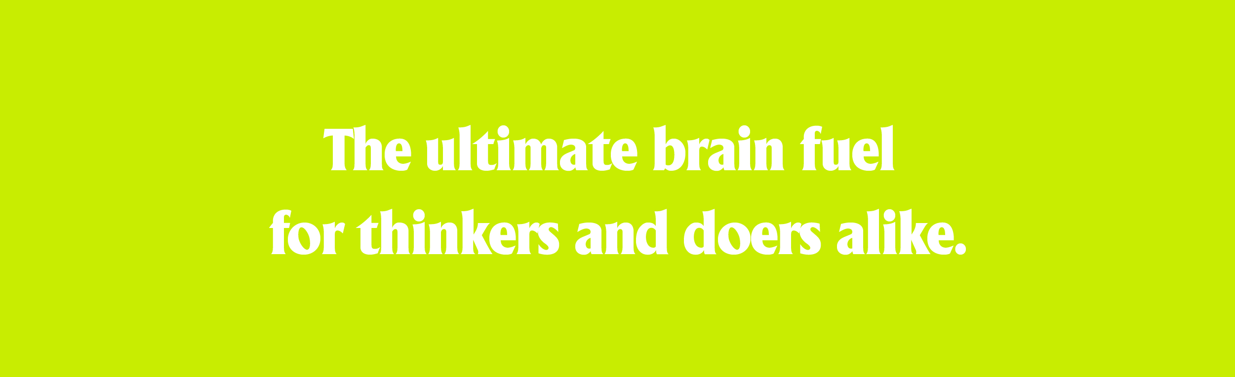
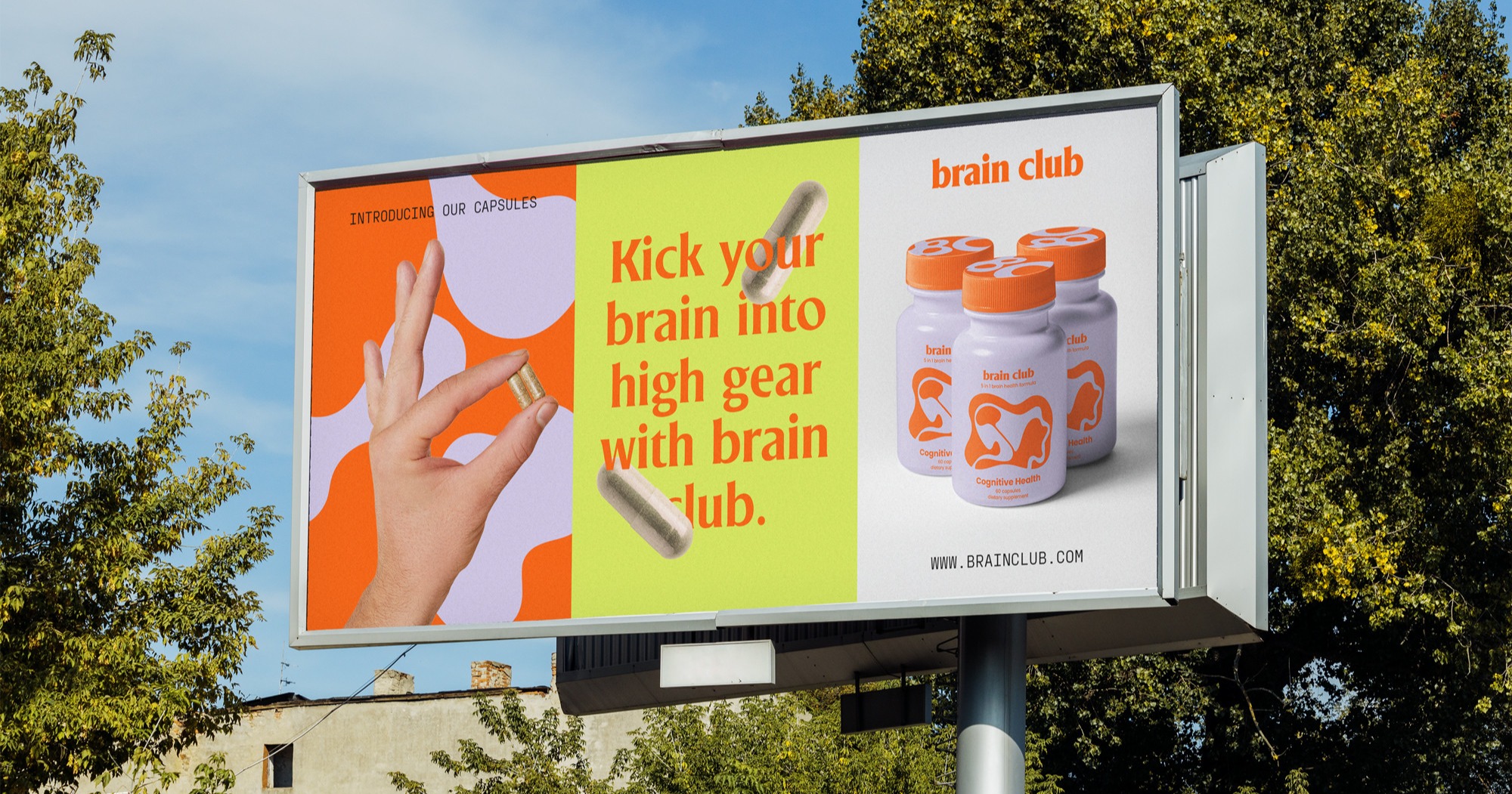
Instead of leaning into sterile science or wellness clichés, we built the brand around energy, optimism and possibility. A place where brain health felt less like maintenance and more like momentum.
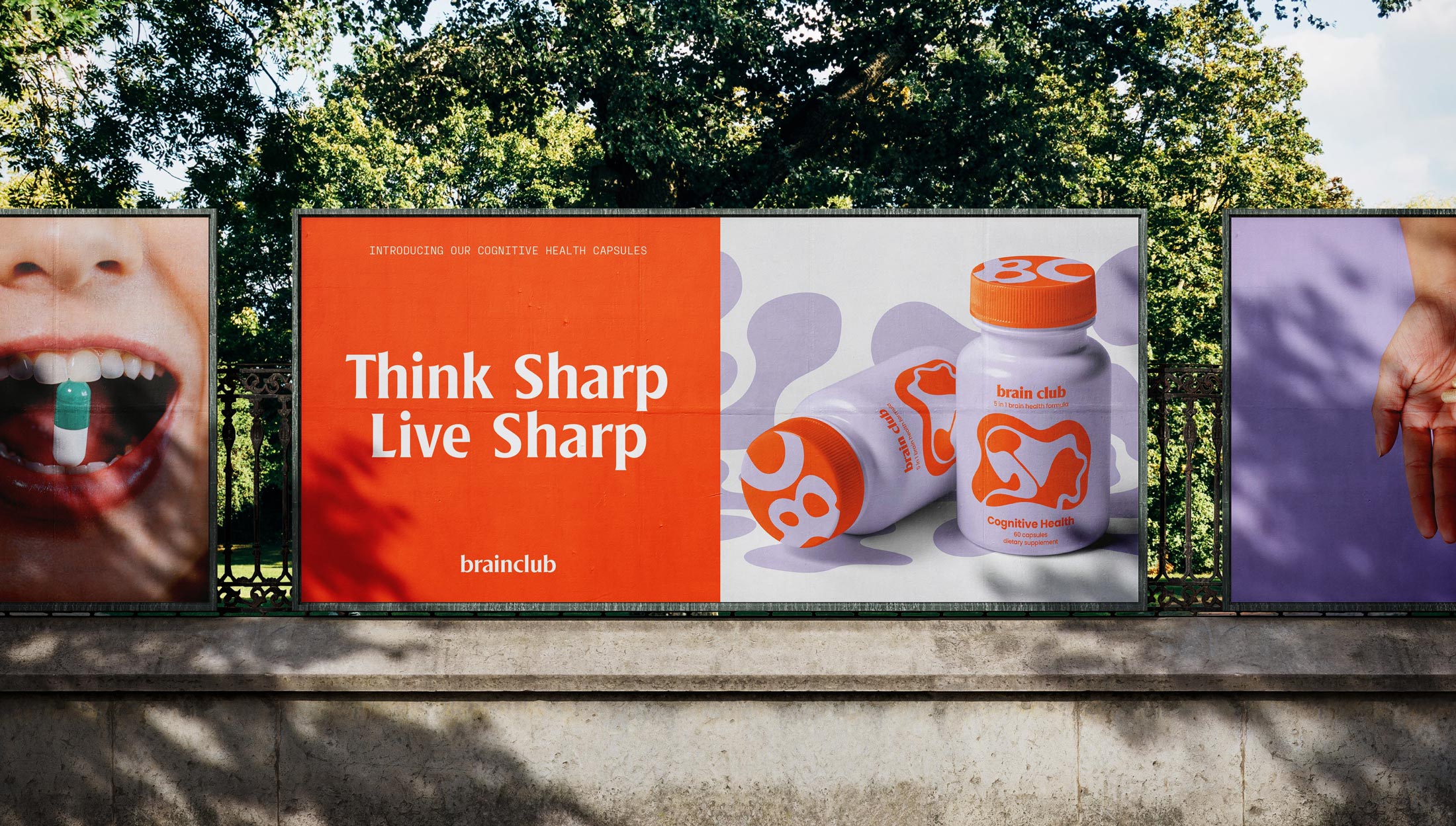
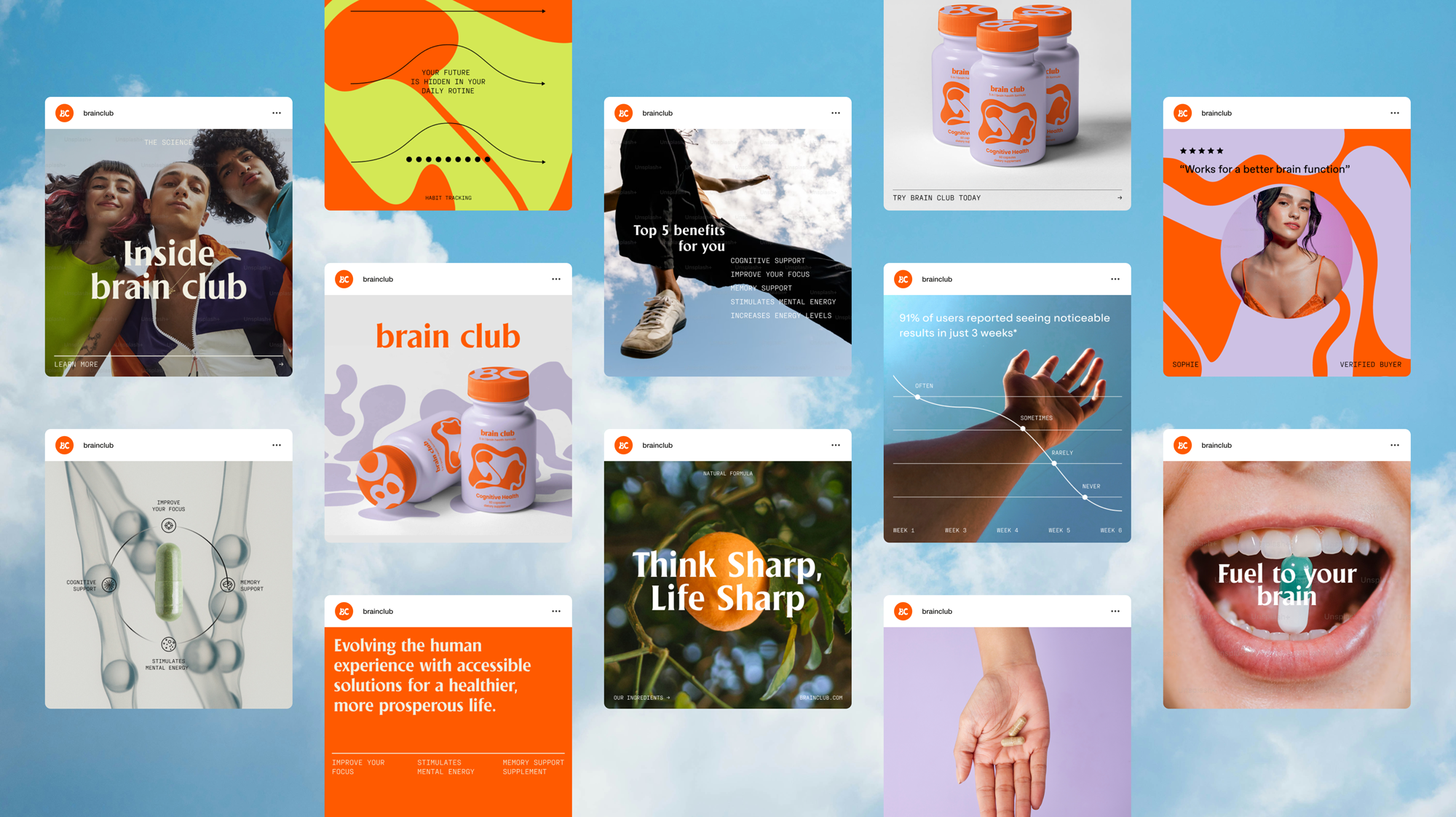
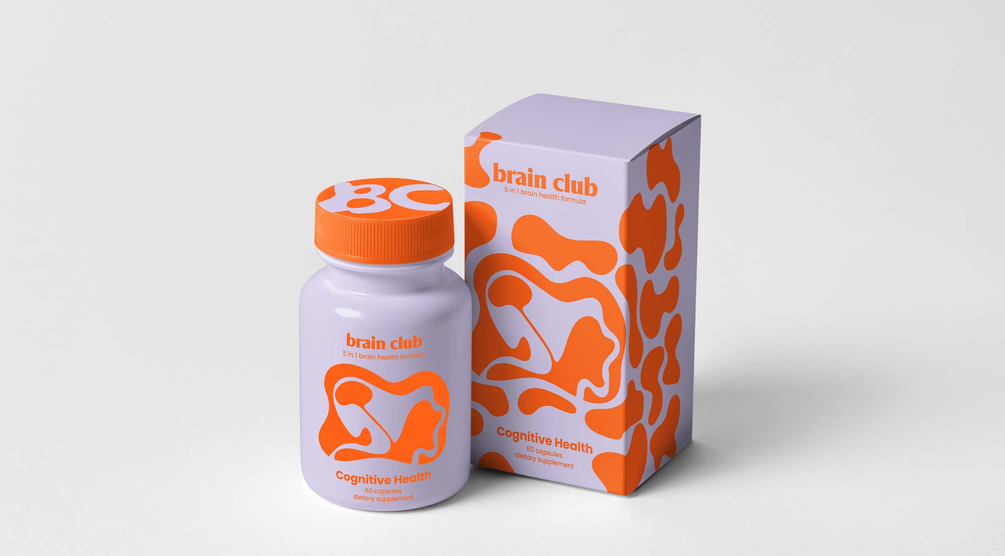
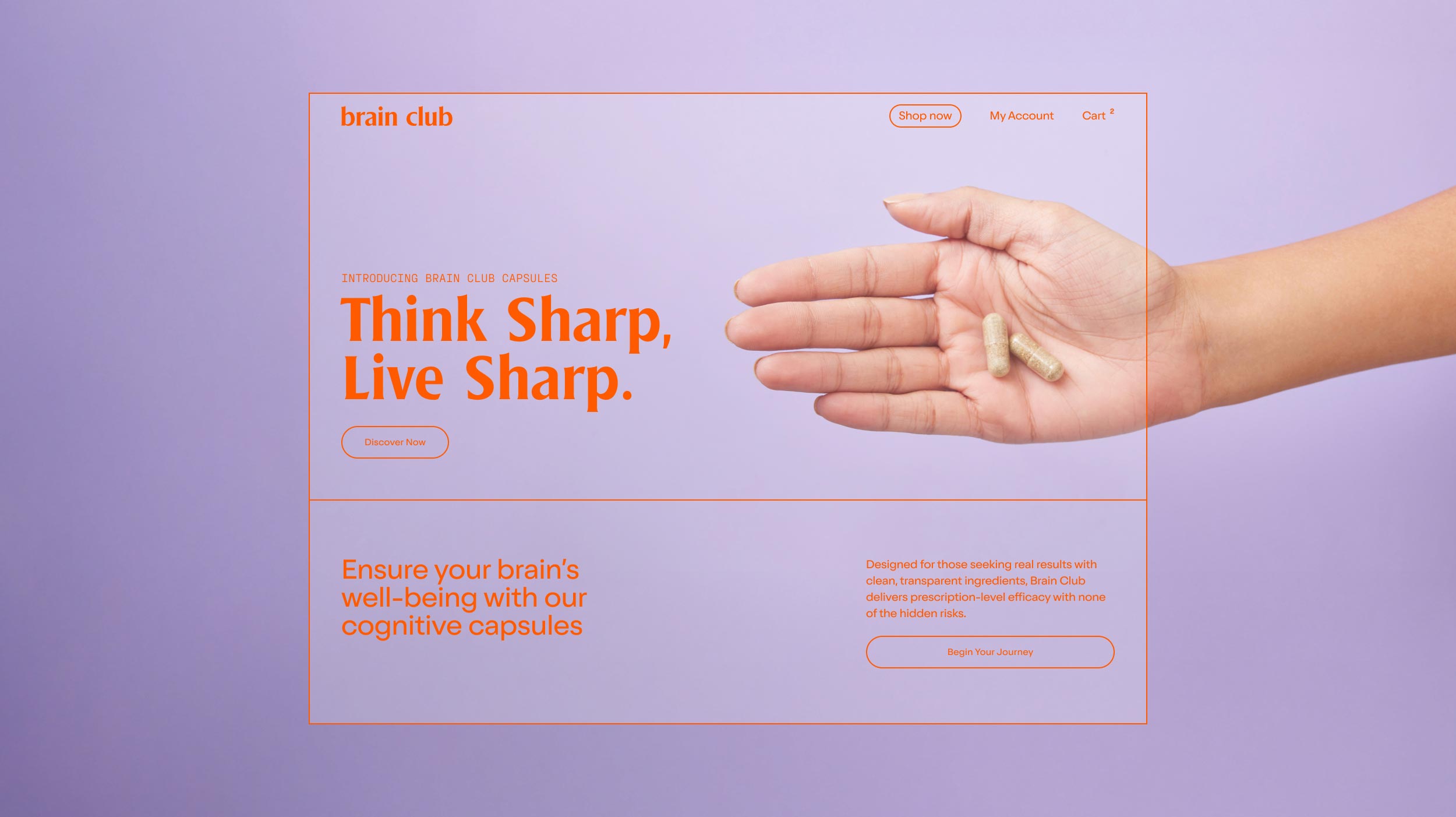
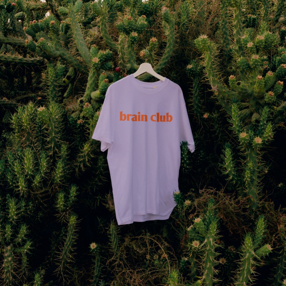
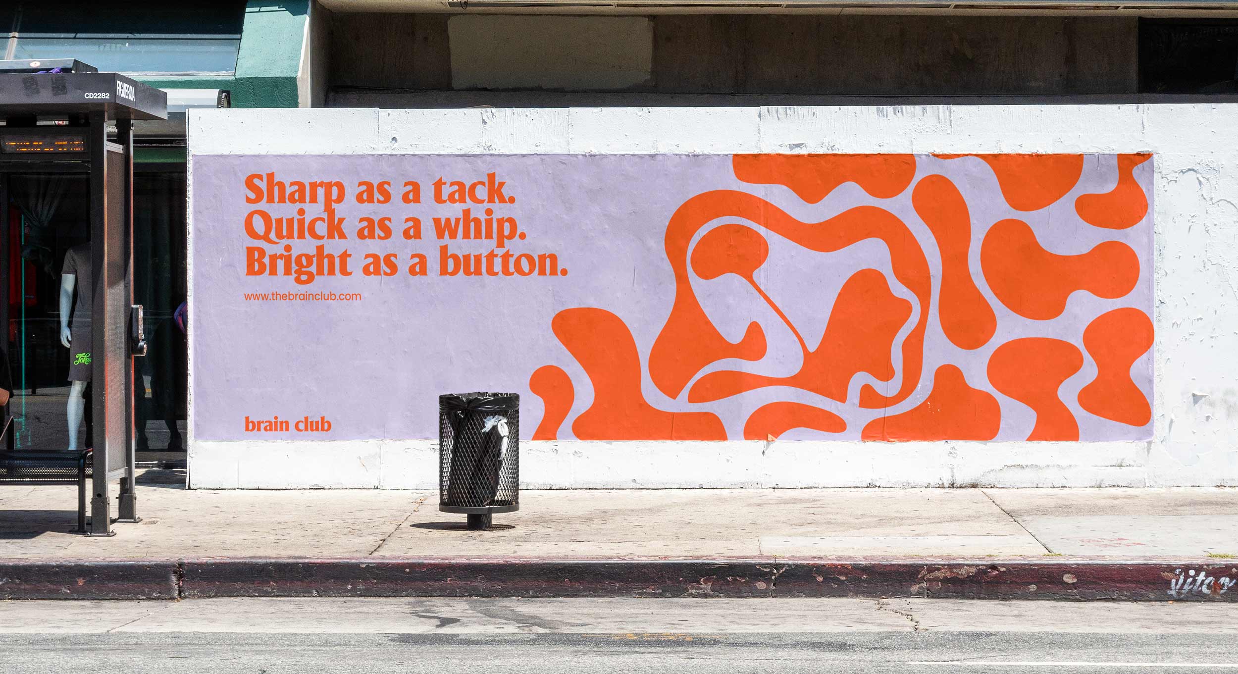
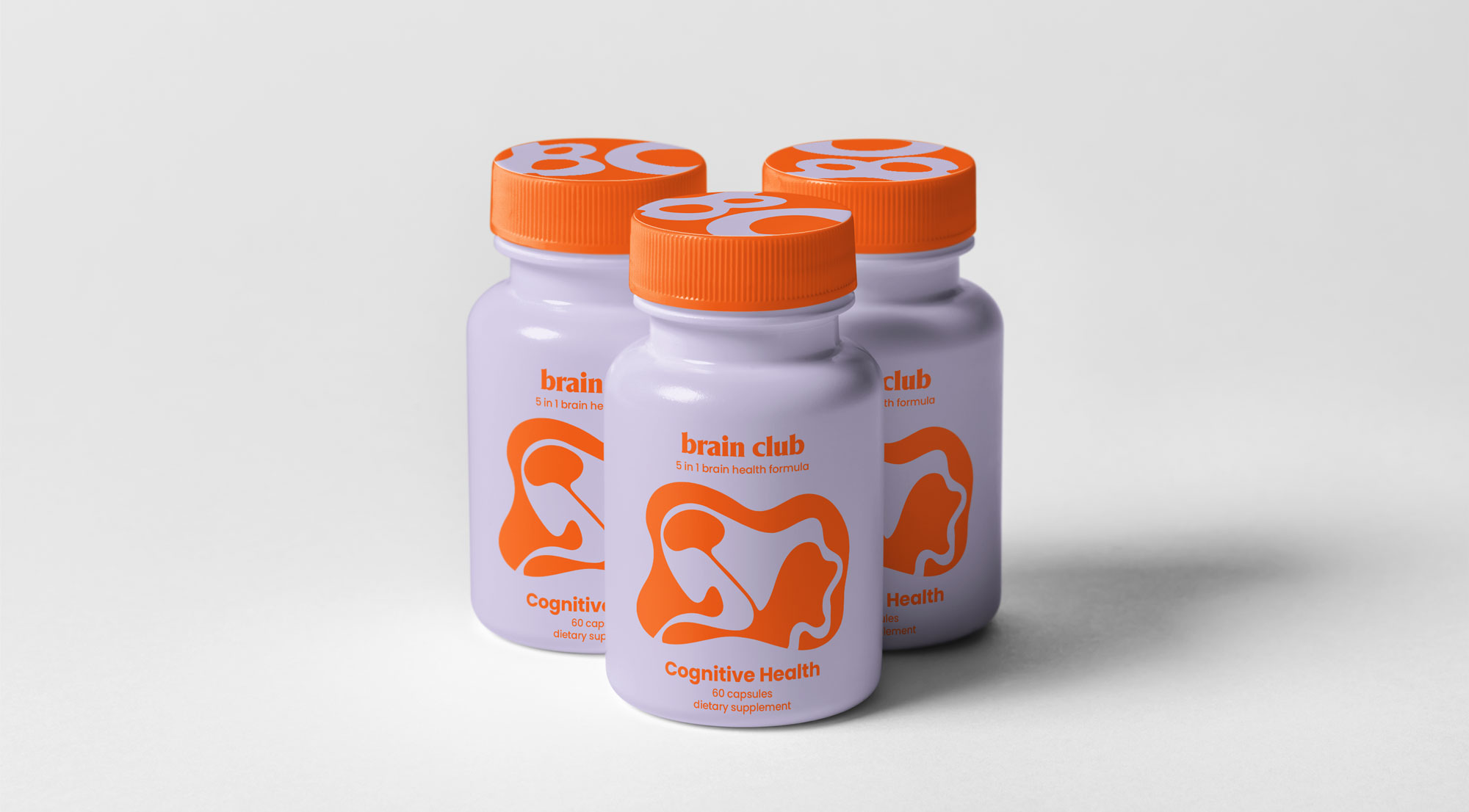
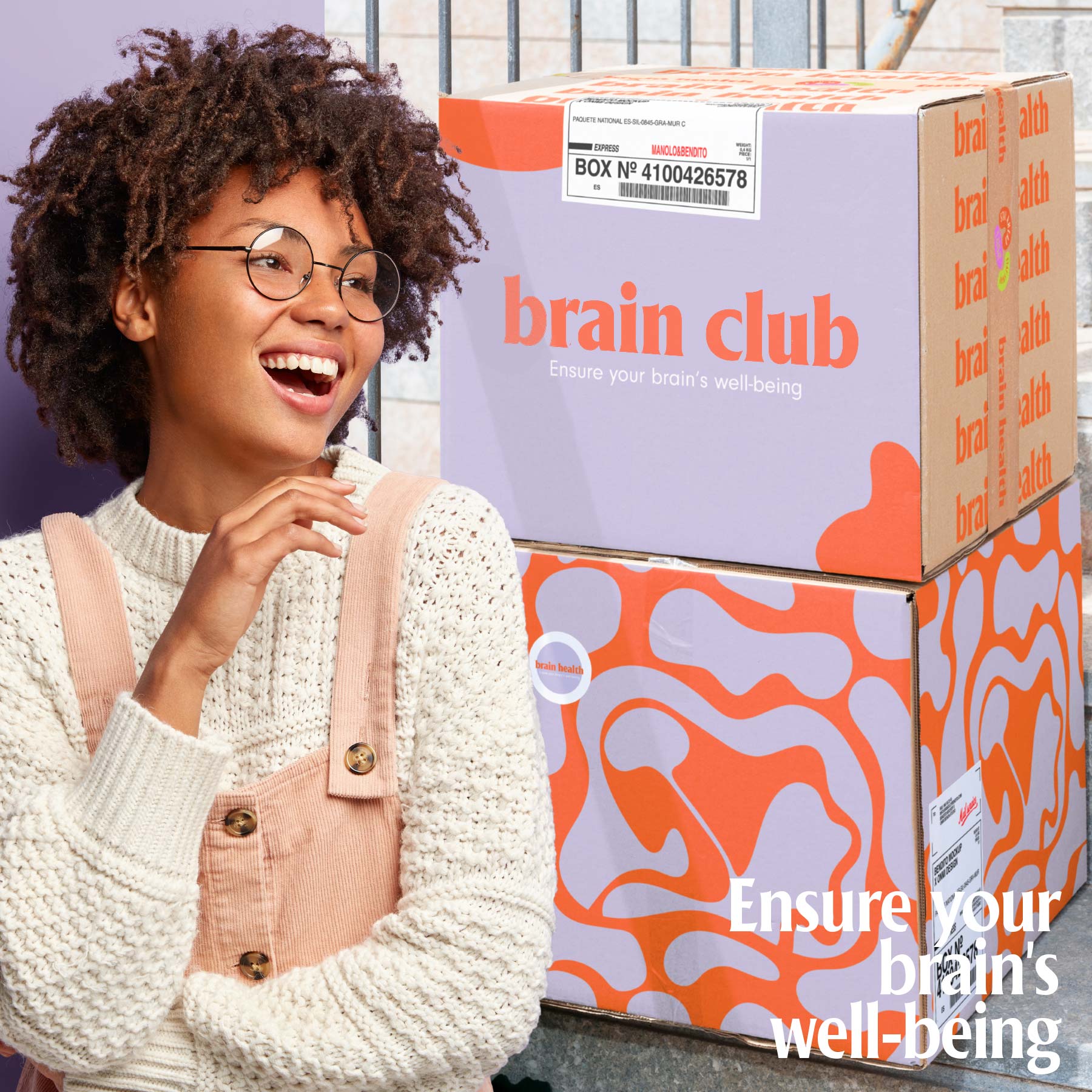
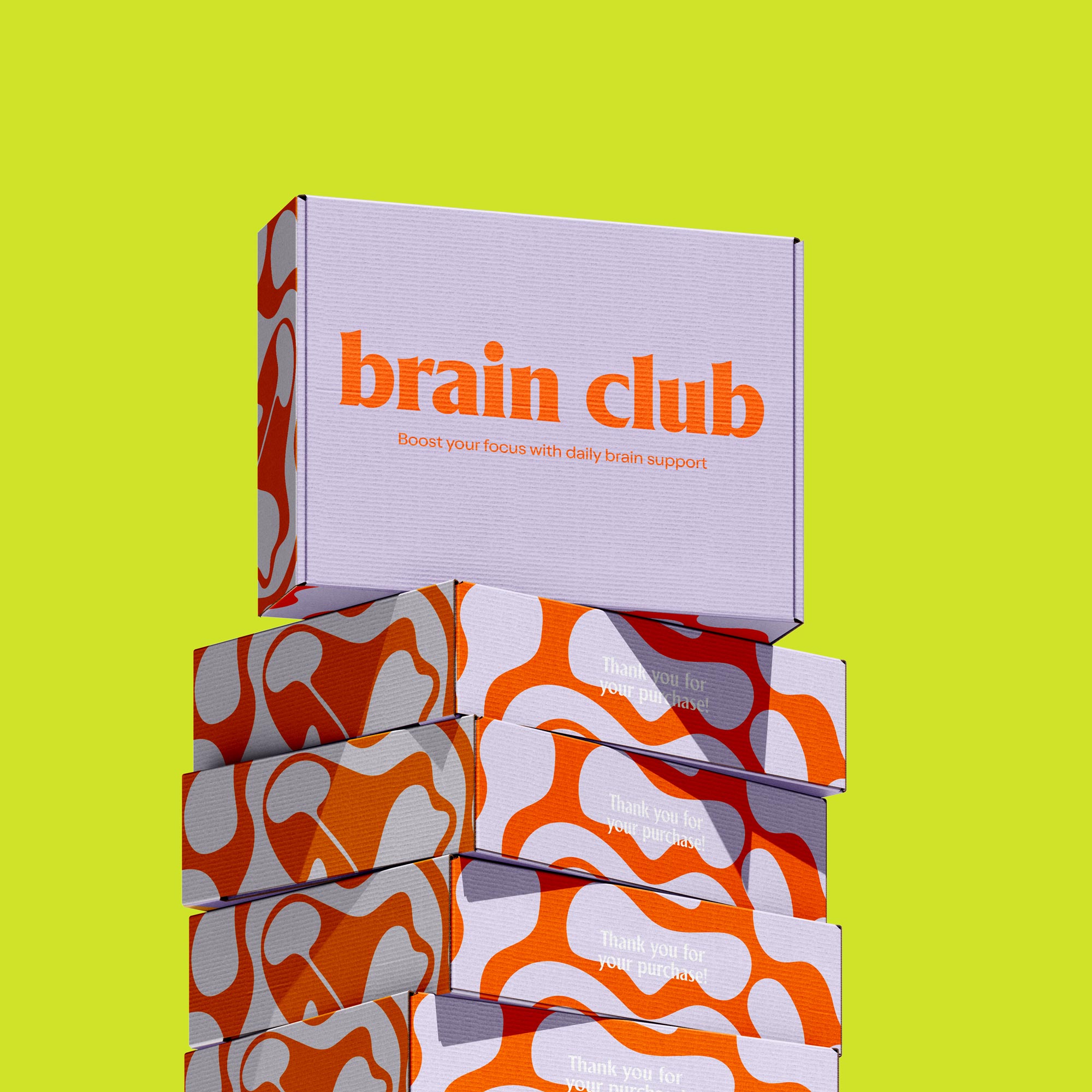
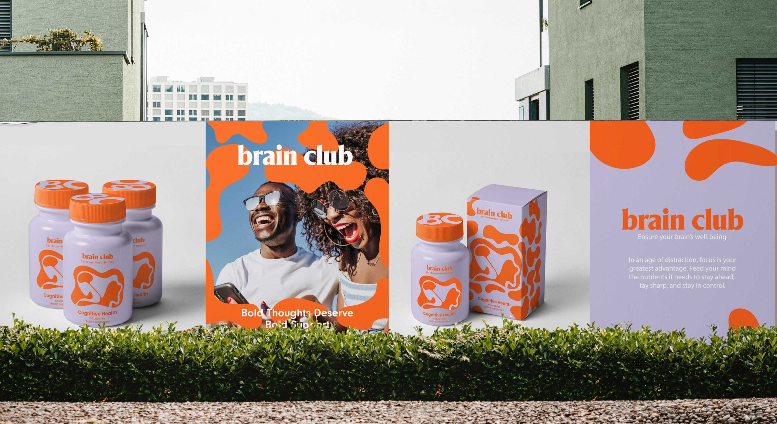
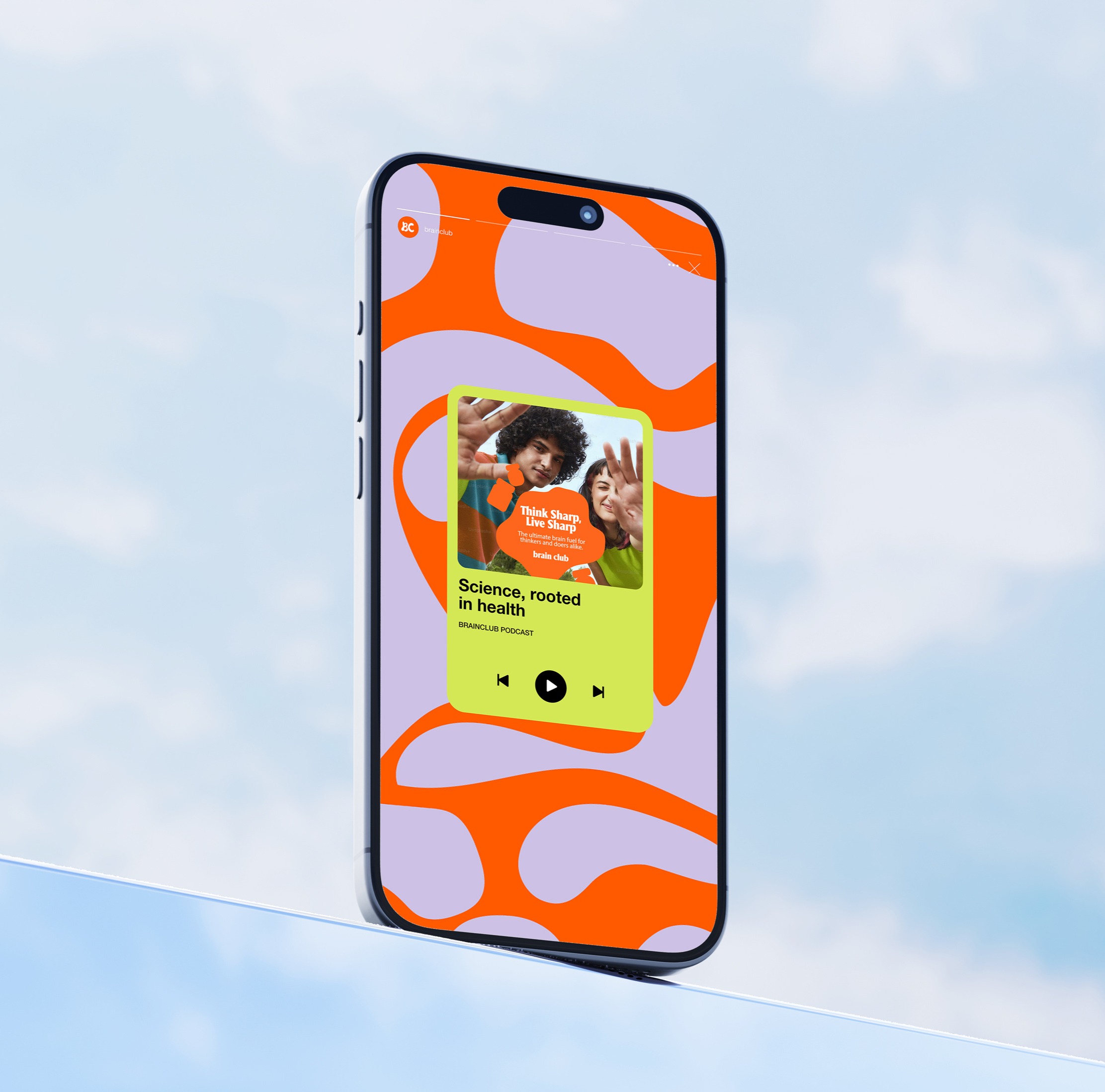
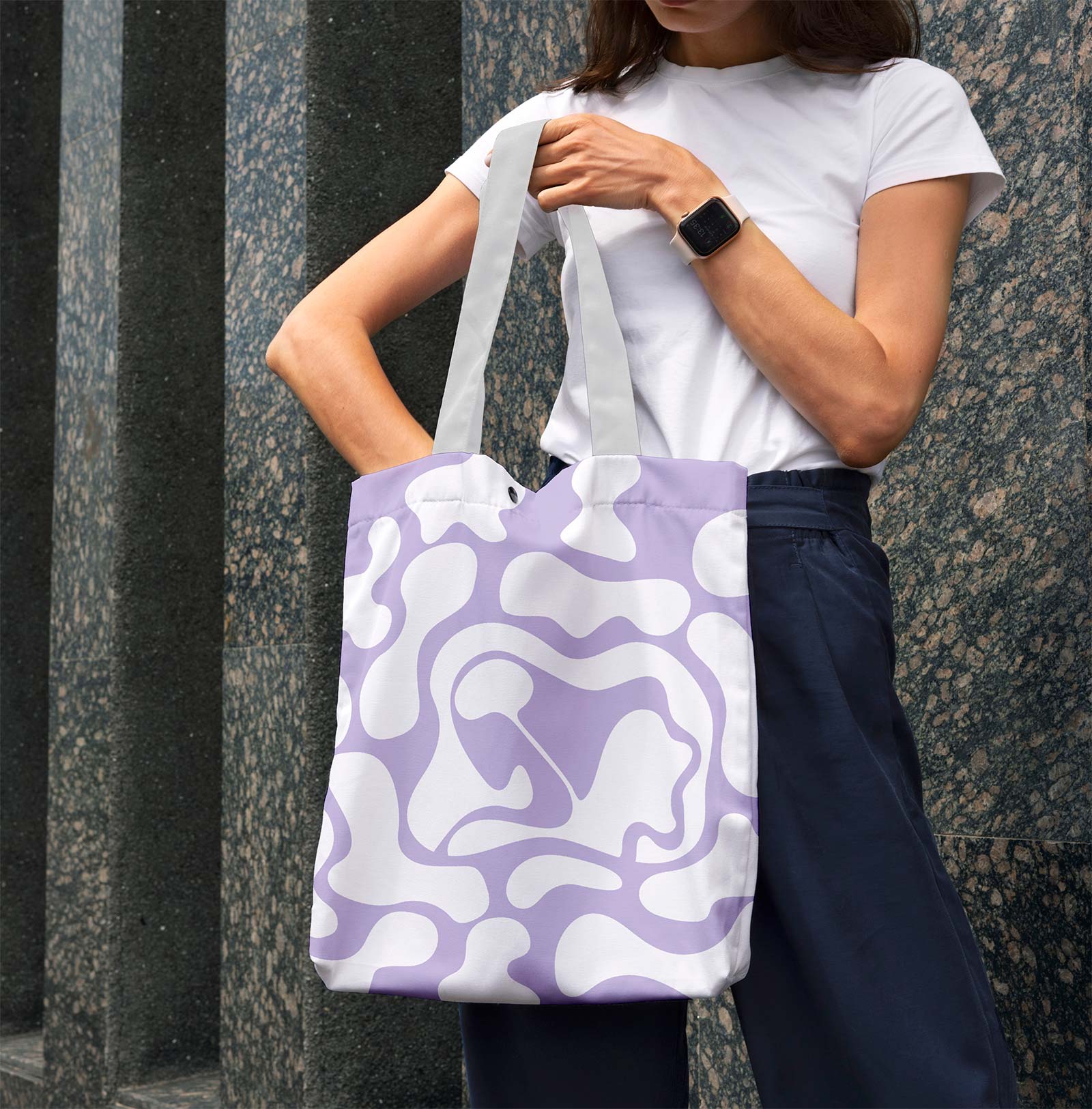
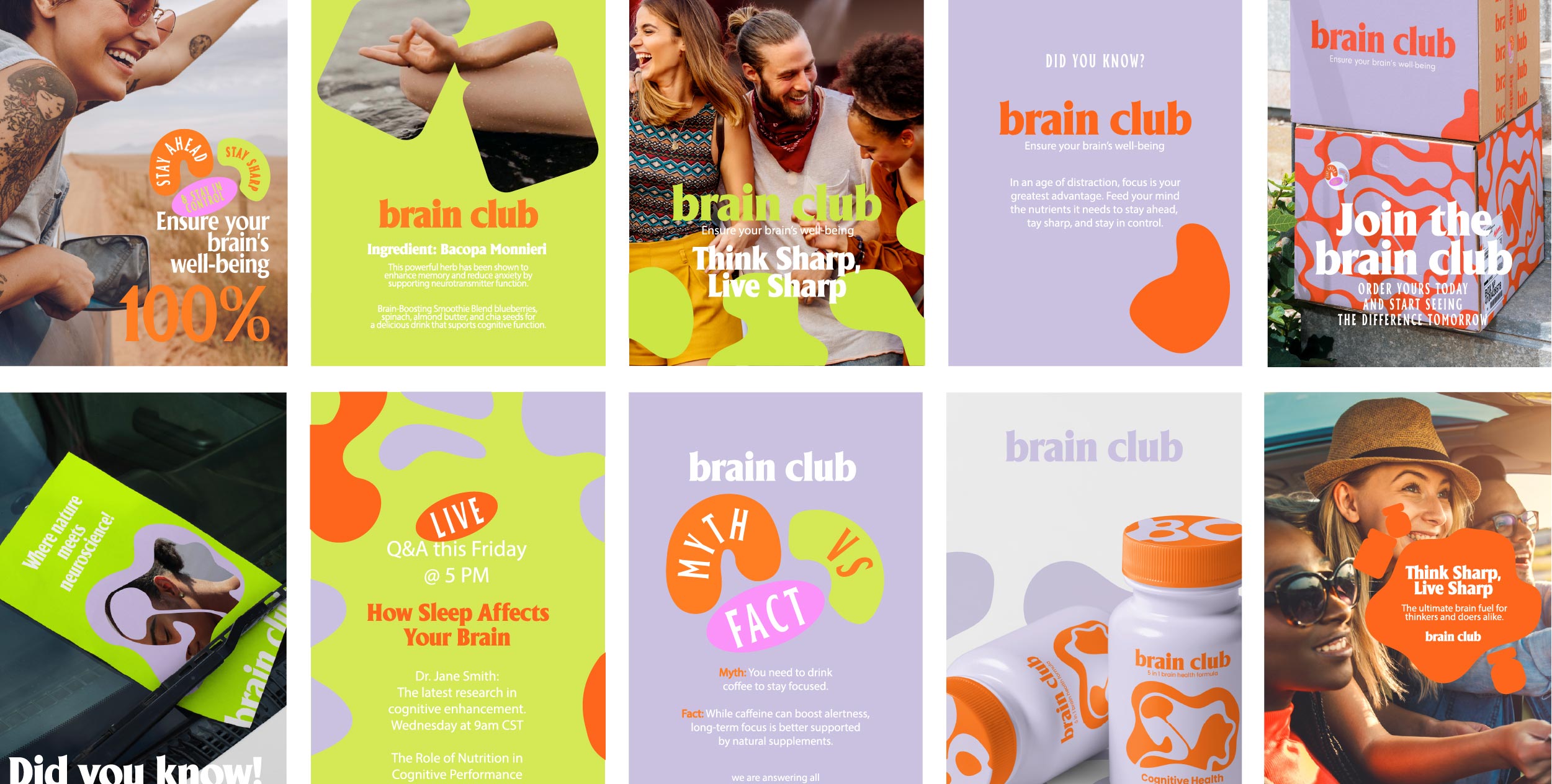
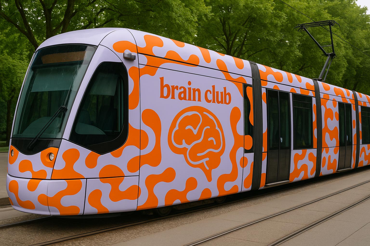
The visual identity embraced vibrant oranges, bold lilacs and high-contrast design elements designed to stand out instantly within a category dominated by predictability. The custom brain-inspired patterns became a recognisable brand asset, helping create a world that felt playful without losing credibility.
At the same time, we developed a tone of voice that balanced intelligence with accessibility. Knowledgeable without becoming intimidating. Confident without becoming preachy. Serious about results, but never serious about itself.
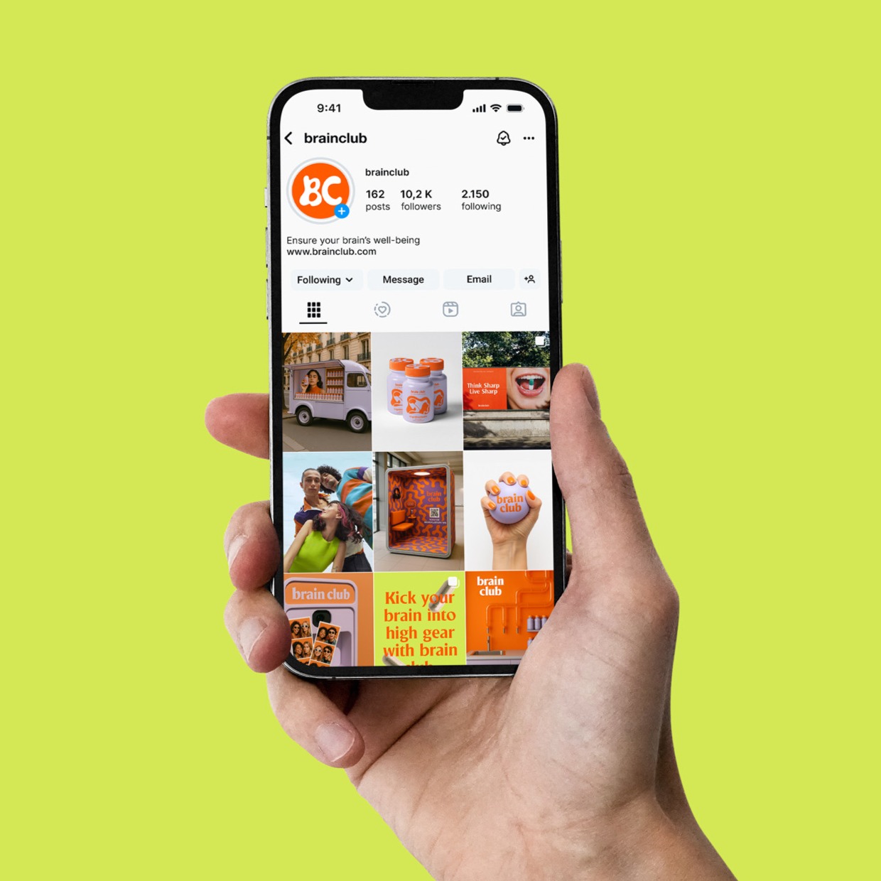
Across strategy, branding, packaging, website design and marketing direction, every touchpoint was designed around the same idea: making cognitive health something people genuinely wanted to engage with rather than simply consume.
The Outcome:
The final result was a brand that challenged category expectations at every level.
Rather than positioning brain health as another task on an already overwhelming to-do list, Brain Club transformed it into something more aspirational, social and culturally relevant. A brand built for thinkers, doers, creators and anyone curious about performing at their best.
The result wasn’t just a supplement brand. It was a platform designed to grow into content, community, product expansion and future opportunities well beyond the bottle itself.